20/11/2019 - Object Sprites and Levels!
Hey! This week we can finally show you some of the things that you're going to find in our levels and I'm also going to share a bit about how we design our levels for Pathfinders.
Lights, Traps, and Levers
First up, lights! Unity, the game engine we're using to make Pathfinders, recently introduced a new 2D lighting system that looks really awesome. We certainly want to implement this in Pathfinders, but seeing the time we have left before release we're not sure if we really are going to do that. If we are, we have two objects that will be light sources: braziers and torches. They're not interactable or anything, they're just there to provide light.


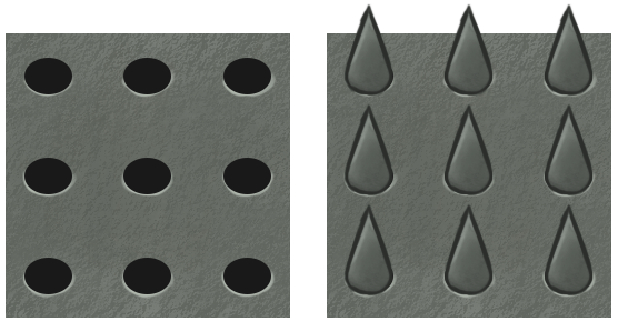
Next up are traps. Traps can be found in a lot of levels. You must make sure your characters don't get caught in these traps. There are traps that are always on, the spikes never retracting. But what's more dangerous are the traps that turn on and off. You can see both the off and on traps below (just in case you don't know, the one on the left's off and the one on the right's on).

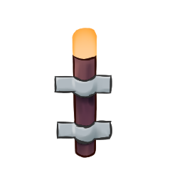
The final one for this post are levers. Originally we already had levers (as you can see from our screenshots), but their colour made it hard for most people to see since the colour is really similar with the floor. We decided instead to make it wood so that it contrasts against the stone floor.

Level Design
Level design is fun, but easier said and thought of than done. At Faberwerks, it's LuceMarvell who designs our levels, along with the help of zalant. We're going to be sharing a bit of how we design our levels.
As a puzzle game, Pathfinders is going to have a lot of levels. Making sure the pacing and difficulty progresses well is difficult and something we admit that we're not experts of (this is our first puzzle game after all). So we decided instead to make the levels first and then arrange them. We just make a note of when which mechanic is introduced and the number of levels that have this mechanic, that mechanic.
But we give our level designers complete freedom within the bounds of the game to make the levels as creatively as they want. The way they do it is usually just random trial and error. Randomly put stuff on the map and see if that works, tweak it, change it, or throw it away completely. I'm going to explain it like we're following the actual process.
First, our designer LuceMarvell starts out just experimenting with putting the elements that are on that level randomly. Once he finds something he thinks can be interesting, he starts adding more detail, tweaking it, and try to play it. He does this all using tools that are not the actual game. He usually uses draw.io, but in the past we've also used Paint, Photoshop, and even PowerPoint.
The reason we do that instead of making it in the game engine is to allow quick experimentation and modification. This way, you're interacting with a bunch of shapes that you can move around quickly and freely, not constrained by the actual systems at work. How do we test it? Manually, of course: using our fingers to trace the movements.
Once he's satsified with it, he sends it to me (as the producer) and also zalant (as one of the designers) and we all try and play it. Then we discuss this level, talking about the issues and how it'll fit into the sequence of levels and how it compares to the levels we already have.
It's a flexible and iterative process that can go back and forth as much as we need. We try to make the levels as best as we can even though this is our first time making them. And not all levels are used. We usually make more levels than we need because we know that some levels are just not going to make the cut, either because they're not good or because we can't fit them in. You can see an example of one of our level diagrams:

The red circles are players, yellow boxes are treasures, blue boxes are levers, green boxes are obstacles that can be toggled by those levers, and the red triangles are the goals. In-game, the levers aren't marked, so you don't know what they open until you try.
That's it for this devlog post! Hope you enjoyed it and that our short sharing on how we design our levels was interesting. That's all for this week's devlog! What did you think of the artwork we posted? What about our level design system? Feel free to tell us what you think in the comments below or on our social media (which you can find here) pages! See you next week!
- Phobez
Pathfinders
A 2D mobile puzzle game about a group of explorers who all move at once!
| Status | In development |
| Authors | Faberwerks, zalfornt, Phobez |
| Genre | Puzzle |
| Tags | 2D, Arcade, Casual, Singleplayer, Unity |
More posts
- 16/11/2019 - Ads and Purchases WorkingNov 16, 2019
- 6/11/2019 - Release Window and Working on AdsNov 06, 2019
- 29/10/2019 - Icons, Coins, Ads, and moreNov 03, 2019
- 22/10/2019 - Devlog #3Oct 22, 2019
- 15/10/2019 - Controls and the Play StoreOct 15, 2019
- 8/10/2019 - The Path BeginsOct 08, 2019

Leave a comment
Log in with itch.io to leave a comment.